The color is a very important element when planning photos . It has the power to stir up emotions, send a powerful message and stick in people’s memory. In reference to branding, a study carried out by the University of Loyola found that color can increase brand recognition up 80 percent. A bit like your logo, your color selection should be chosen carefully, as it will likely stay the same for many years to come. The same can be said for an outfit that you choose for a family photo session. By keeping in mind where the final product will go, whether on a wall in your living room or your Instagram feed. Choosing the right color pallet can make you love your photo and want you to put it everywhere. Or you may love it but are not sure what to do with it. Sometimes it helps to know the meaning and statement associated with each color before weaving it into your communications. Here are the most common associations:
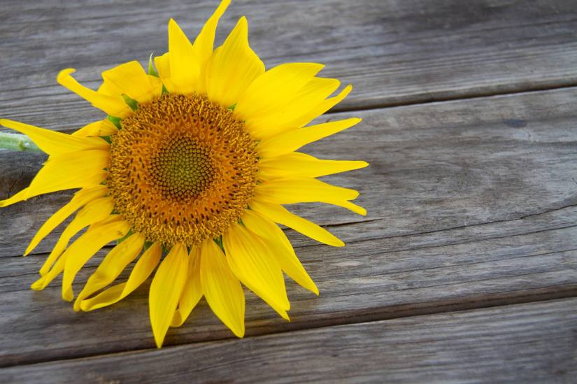
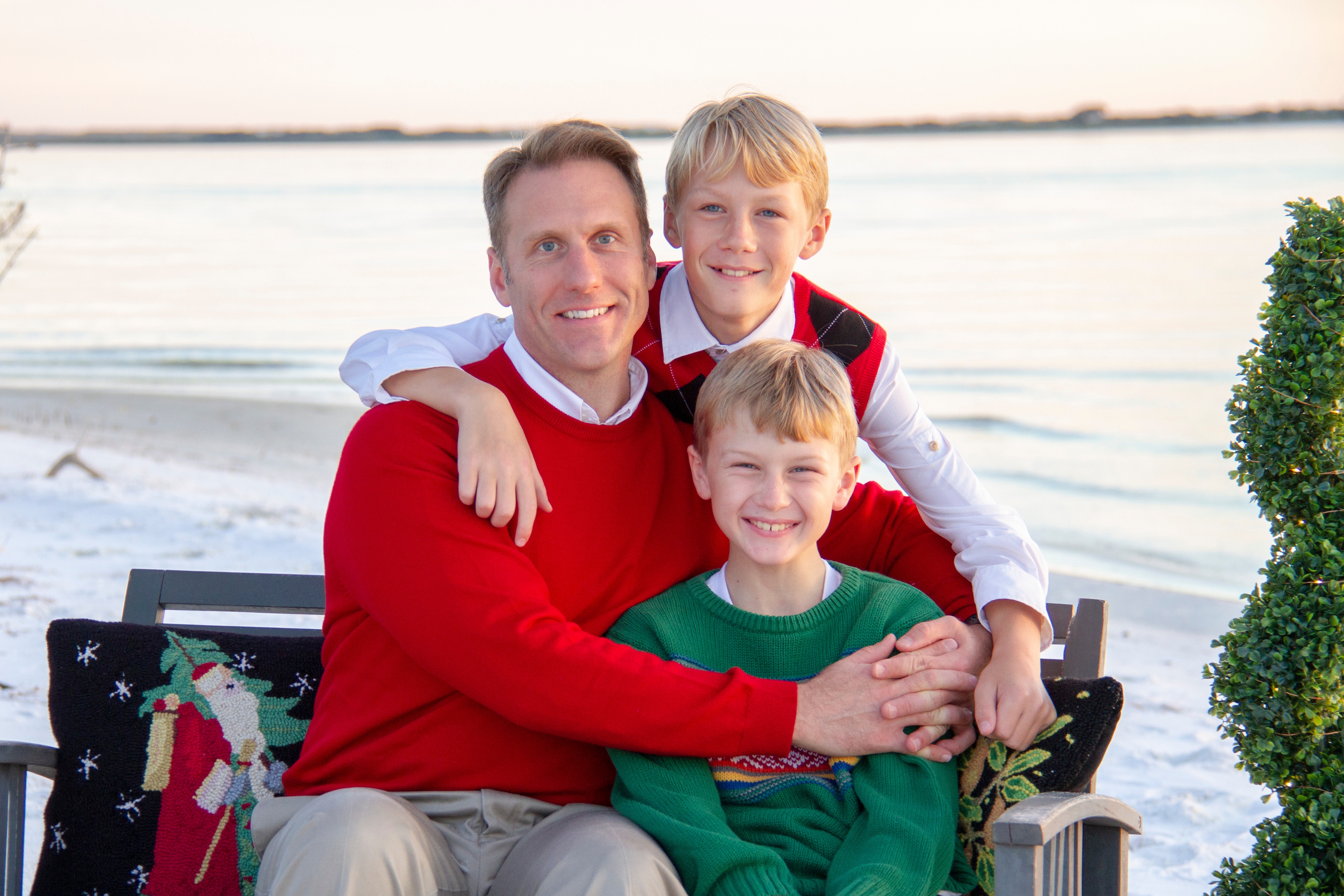
Red: energy, power, danger, determination, passion, desire, love, activity, vitality, motivation, playfulness, enthusiasm, courage.
Yellow: happiness, joy, intellect, warmth, energy, vision, caution, creativity, independence, self-motivation.
Orange: sunshine, tropics, joy, fascination, happiness, enthusiasm, creativity, attraction, determination, success, stimulation, optimism, energy, humor, productivity, endurance,
Green: nature, growth, harmony, safety, freshness, fertility, rebirth, spring, change, relaxation, youth, luck, healing, prosperity.
Blue: communication, wisdom, reliability, truth, loyalty, integrity, leadership, peace, truth, stability, depth, faith, heaven.
Purple: ambition, luxury, inspiration, royalty, magic, mysticism, wealth, personal power, spirituality, mystery.
Black: elegance, mystery, formality, evil, strength, luxury, power.
Brown: stability, earthiness, self-control.
White: purity, truth, cleanliness, refinement, innocence, goodness, light, spirituality, openness.
Pink: friendship, affection, femininity, softness, love, warmth.
Enter the color wheel.
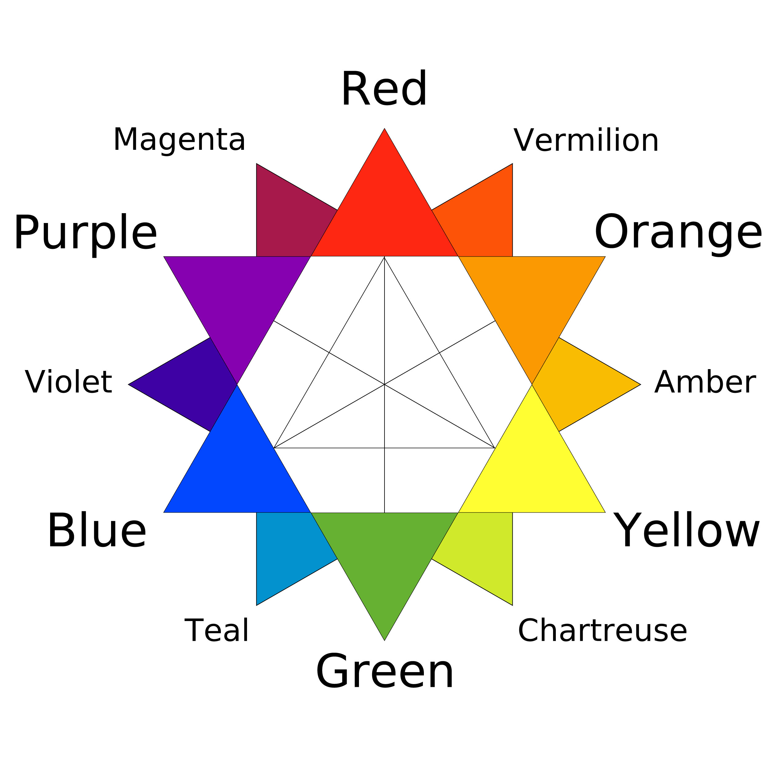
The color wheel is a great start to choosing color. Colors that are opposite from each other, like red and green. Create a contrast and make for a more vibrant color. Which is why Christmas colors are always so cheerful.
Colors that are close to each other on the color wheel make a more calmer and peaceful feeling. So blues, greens, yellows and oranges.

Can you feel the difference between the images.
I always like to educate my clients on color choices before a shoot so they can make the best choice when choosing outfits.
